Death by PowerPoint: Why Science Teaching Needed a Visualiser Revolution
Paraphrasing a small-scale classroom study on exposition and engagement; an origin story in content delivery evolution...
Formative Years and a Pedagogical Shift
In the Easter term of my PGCE year, a new Science-teaching Assistant Principal arrived. He had a keen eye for pedagogy and an appetite for constructive change. He used his IPEVO 4K visualiser as his whiteboard, a digitised renaissance of chalk and talk. His first challenge to us was deceptively simple: move away from PowerPoint-led expositions and teach through the visualiser. He had a vision of a new scheme of work and resources adapted for visualiser-based expositions.
It was a curious proposal at first. I was of the last generation of students in which PowerPoint and screens were not prevalent in the classroom. When I returned, PowerPoint was the classroom lingua franca. It lent order, sequence, and polish. Yet beneath that sheen lurked something sterile, a kind of pedagogical PowerPoint karaoke. Slides became scripts, and exposition became narration. PowerPoint was not alien to me; I had sat through many lectures and talks delivered with a wide range of quality, unfortunately. In addition, as I progressed through academia, many lab team meetings and journal clubs utilised PowerPoint (and for the mavericks, Keynote).
To this day, I remember delivering my first-ever lesson. I was tasked with teaching sub-atomic particles and isotopes in the context of physics. I was given some trust-centralised resources. I spent five hours faffing about with animations. Added a very reaching analogy of Superman and electron energy levels. Off to the race, I go.
I asked the peripatetic senior science consultant from the trust to observe my lesson. My teacher-talk was on point, or so I thought. Seeing that I was not where I expected to be based on my slides and the lesson time, I made the executive decision to skip the independent task questions. “They will just slow me down from completing the slides”. And that was the problem.
A fascination with getting through the slides, a habit calcified from my previous career. Granted, it was my first day in the job. And it was baptism by fire, but I was also sullied by the presentation mindset of finishing the slides. These were children, not board-level stakeholders. The consultant, as lovely as he was, couldn’t hide his frown of frustration at my yapping at the pupils. Lovely feedback though; you were always helpful, M 🫶🏽
From Concrete to Abstract and Back Again
During CPD, the Assistant Principal cited Doug Lemov’s axiom from
: Board = Paper. In essence, the visualiser should be your whiteboard and your students’ page at once, an analogue mirror that makes thought visible. You start with a blank canvas and build knowledge in real time. While PowerPoint can have its place in a lesson, the issue is that PowerPoint slides are primarily for presentations. Lessons are not presentations. An exposition is not a presentation.“PowerPoints are for presentations. Lessons are not presentations. An exposition is not a presentation”
Did the Assistant Principal leave us to the wolves and let us figure it out by trial and error? On the contrary, he delivered weekly CPD on how to use the visualiser and, if a new topic was coming up, how he would provide that exposition. Expectations were set from the outset: this transition would not be quick or easy, but we would become better practitioners.
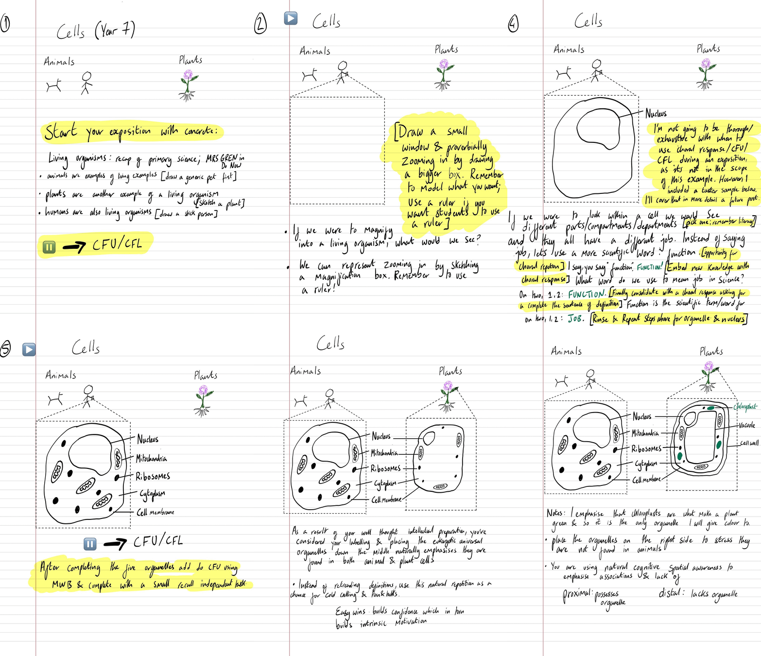
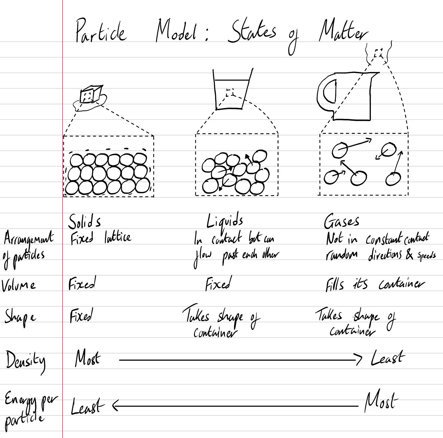
One of the first examples I remember him delivering was a Year 7 lesson on cells. You begin not with organelles, but with life itself: a stick figure of a person, a warm-blooded pet, a plant. Then, you zoom in by drawing a small box on the limb, with lines extending to a larger box that serves as a zoomed-in window where we will draw a cell.
Each new feature is drawn, labelled, and explained in real time. You pause to check for understanding, then move on. By the time you finish, the students have watched an idea materialise from nothing, and they have copied that act of creation in miniature. Each instruction was itemised and deliberate: do not annotate with arrows, as that will be confusing later; be methodical about where you place your labels.
When we moved on to the particle model, it was clear: use arrows for motion. Larger arrows represent larger motion and therefore more energy.
It was the stage in one’s journey when you take in new instruction like a sponge. The AP even encouraged us to deliver CPD sessions on an exposition from a subject we taught. Discussion and feedback were welcomed: when should students hold pens? How many colours? Which pens bleed through?
The cost of engaging students was the teacher’s intellectual preparation. No longer could one turn up, put on a slide deck, and wing a lesson. You cannot improvise through a blank page. You must know when to pause, when to annotate, when to breathe. Inexperienced teachers are forced to plan with precision, and experienced ones rediscover how much thought clarity requires.
“I hate the way people use slide presentations instead of thinking…I wanted them to engage, to hash things out at the table, rather than show a bunch of slides. People who know what they’re talking about don’t need PowerPoint.”
Steve Jobs
The Study Begins
In my second year of Teaching, as an ECT at an academy chain, I also worked under the supervision of Researchers in Schools (then part of The Brilliant Club). I conducted a graduate-level research project at Sheffield Hallam University. Coming from a research background in the hard sciences, I wanted to examine—empirically, even if modestly—whether the shift from slides to visualisers made a measurable difference.
I designed a small-scale comparative study:
Three cohorts across Key Stage 3 (Years 7–9)
Two delivery modes: PowerPoint-led vs visualiser-led exposition
Quantitative strand: analysing student work quality (facsimile accuracy, questions completed, correctness)
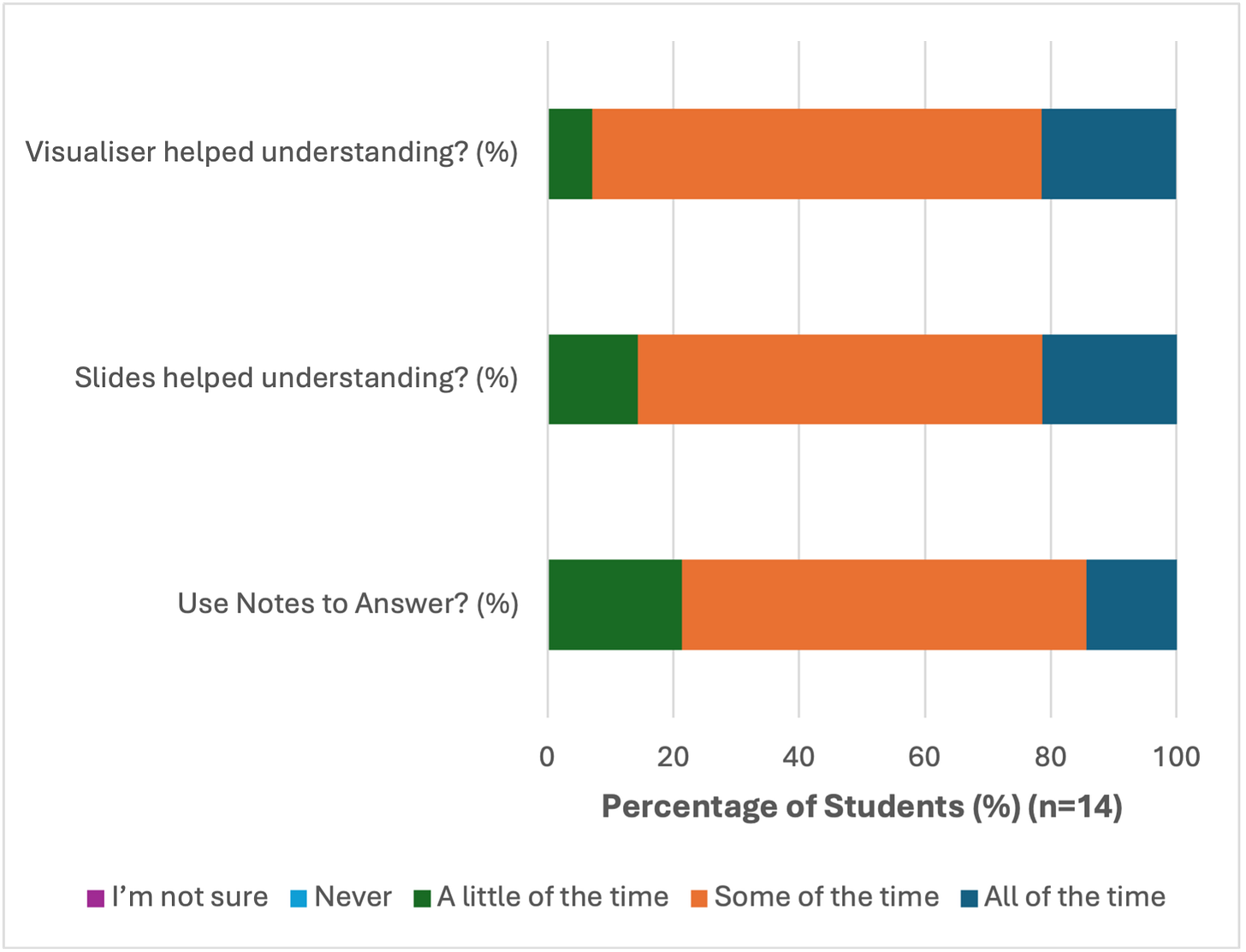
Qualitative strand: short written reflections from students about each mode
Ethics clearance, consent forms, and data handling followed the full rigour of protocol. I even ran a one-tailed t-test, though the scientist in me knew the sample size was laughably small. Still, the endeavour was not of attaining a much-sought-after p-value, giving my work statistical significance; it was merely the intellectual curiosity.
Figure 1 – Lesson design and counterbalancing across Years 7–9 (AB/BA sequence).
Figure 1 – Lesson design and counterbalancing across Years 7–9 (AB/BA sequence).
Death (to Education) by PowerPoint
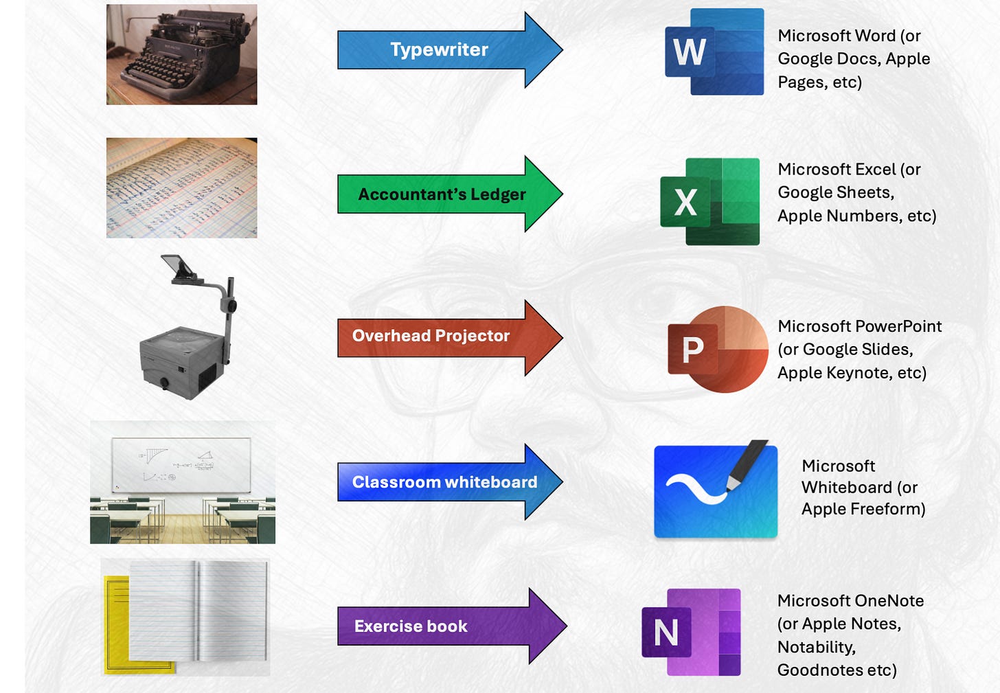
To understand the problem, you must first understand skeuomorphism. In design, a skeuomorph mimics a real-world object in digital form. Microsoft Word imitates a typewriter. Excel imitates an accountant’s ledger. PowerPoint imitates the overhead projector.
That imitation is precisely the issue. PowerPoint wasn’t born in a classroom; it was born in a boardroom. Its DNA is corporate: bullet points, transitions, applause slides. It was never designed for the dynamic act of Teaching, which is not the transmission of content but the orchestration of thought.
The problem with PowerPoint isn’t the tool. It’s the temptation—the illusion of completeness before understanding.
When you project a slide, students become spectators. The teacher becomes an orator, reading from a prompter. There’s an asymmetry of attention: eyes fixed on the screen, not on the teacher’s hand or the unfolding reasoning.
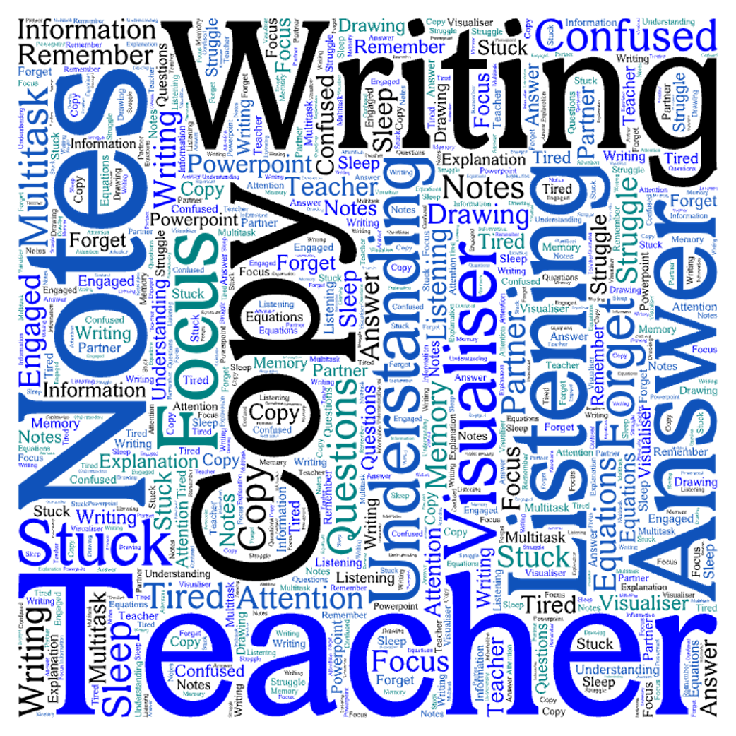
The students’ reflections confirmed this pattern. Many wrote that PowerPoint lessons made them “zone out,” “lose track,” or “want to sleep.” Several said they didn’t know when to write. A few admitted they stared at the pictures.
Even those who tried to keep up confessed confusion: “I was trying to understand what he was talking about because I was confused,” one wrote. Another said, “PowerPoint was basic.”
’s learning principles—that working memory is limited and people can attend to only a handful of stimuli at once—rang loudly in my head. The students weren’t inattentive; they were overloaded.Hinterland Knowledge – The Apple Aesthetic and Skeuomorphism
Skeuomorphism wasn’t born at Apple, but Apple made it famous—and then killed it.
In design, skeuomorphism refers to digital elements that imitate real-world objects: a notepad app with faux leather stitching, a calendar with paper tears, a bookshelf app with polished wooden shelves. The aim is familiarity, to ease users into new technology by grounding it in the old.
Steve Jobs and Scott Forstall, who led Apple’s software design through the 2000s, championed this philosophy. They believed realism in digital design served as cognitive scaffolding. A new user opening an iPhone should feel at home—the skeuomorphic textures and shadows were comfort cues, not mere decoration. Remember, this is 2007, no one outside of Cupertino knew how to use an iPhone.
Jony Ive, Apple’s chief industrial designer, took the opposite view. To him, skeuomorphism was ornamental clutter: the aesthetic equivalent of PowerPoint transitions. He argued that digital tools should be confident in their abstraction—flat, functional, and unembellished.
After Jobs’s passing in 2011 and Forstall’s departure a year later, Ive’s design team seized the moment. With iOS 7 (2013) came the significant flattening: gradients vanished, shadows dissolved, and leather stitching gave way to clean geometry.
It was more than a stylistic shift; it was a philosophical one—the rejection of imitation in favour of clarity.
And perhaps that’s the lesson for teaching too: when our tools imitate other domains too closely, we risk inheriting their limitations.
Further Reading & If you’re interested even more reading from
The Visualiser as a Cognitive Scaffold
By contrast, when I used the visualiser, the same students described being “more engaged,” “more focused,” or “copying along.” Several noted that they understood because they saw how to lay out the work.
One Year 8 student captured it neatly:
“When the teacher is writing in their book, I write with them, but sometimes I can’t see and ask them to make it bigger.”
Even the struggles were pedagogically rich. Visibility issues are logistical; zoning out under slides is cognitive.
The difference was not only in what students did, but in what I did. The visualiser forced me to think aloud, to pace the lesson with my pen. There was no autoplay, no next-click temptation. The exposition became a slow reveal rather than a broadcast.
Cognitively, the rhythm matters. The hand slows the mind, the voice syncs to gesture, and the class moves in shared tempo. That synchrony—of writing, watching, and listening—is what embeds knowledge.
Dual-coding theory would describe this as aligning verbal and visual channels; classroom reality describes it as finally getting Year 9 to stay with you for a complete sentence.
Findings in Miniature
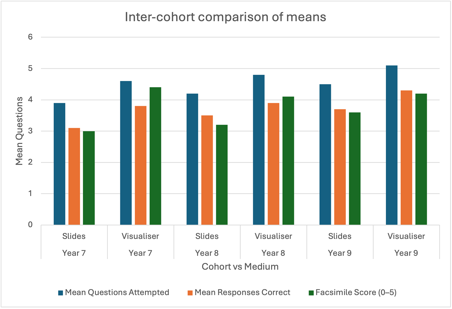
The quantitative data, limited as it was, suggested small but consistent gains in accuracy and question completion after visualiser-led lessons. The t-test results nudged toward significance across cohorts, but the sample was too small to brag about in polite research company.
More interesting were the qualitative themes:
- Students were more attentive and less likely to drift during visualiser use.
- PowerPoint-heavy lessons induced passivity—”like watching TV.”
- Visualiser lessons encouraged mimicry and focus, though a few reported “feeling rushed” when writing simultaneously.
In short, the tool that most closely mirrored the teacher’s hand anchored the students’ minds.
Cognitive Reflection:
PowerPoint externalises content.
A visualiser externalises thinking.
Caveats and Reflections
As a research scientist in a past life, I’ll be the first to state plainly: this was not an extensive study. It lacked repeats, randomisation, and power. It was messy, human, and school-timetabled. But it was also the kind of research that matters most to practitioners—inquiry at the chalkface.
By barring repeats, you barred your error bars — and made your first error.
Another advantage to visualisers is that you’re always facing the students. Elevate the visualiser on a stand or lectern, and stand to deliver where possible (for accessibility). However, some disadvantages remain: contrast may be low, which is a visual hindrance; your hand gets in the way; you can only zoom in so much; and students may find it difficult to read your handwriting—especially if it’s like mine and not the neatest.
From experience, expositions from a blank canvas can take longer if you want students to copy what you’re doing as well (note to self; definitely attend webinar on Cancelling Copying). These are conversations about how you want your team to implement visualiser expositions well. If done well, delivering exposition with a visualiser is like Simba channelling his ancestors—generations of teachers who taught via chalk and talk. It especially excels at procedural and skills-based content:
Visualisers/tablets-based expositions and modelling excel most with procedural and skills based content
Let’s look at it from another perspective: there is a performative element to teaching. And in a performance, you sometimes have to slow it down. Think it’s too slow? Still not slow enough. What am I even talking about now? I am referring to advice Stephen Amell—famously portrayed the Green Arrow on CW’s titular show—gave in an anecdote about advice he received from Triple H. While being both a thespian and a professional wrestler are performative, professional wrestling deals with a live audience; therefore, the key moments need to be slowed down as there are no second-takes.
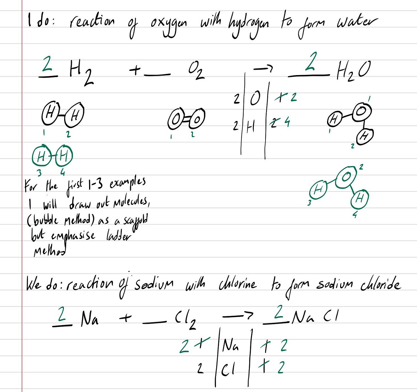
Similarly, when you are elucidating to your audience how to balance a chemical equation or ensuring the variables in an equation are in the correct base unit, slow the steps down—the natural cadence of transcribing the stages by hand forces time into the room. Nothing appears through some PowerPoint animation cosplaying as a deus ex machina reveal. The logic earns its place on the page, one small cognitive stride at a time.
On a slide, the teacher will naturally zip through the worked steps almost as fast as they can mash the next button. The animations glide in, the cursor dances, and everything looks crisp. There is confidence in the delivery. The problem sits elsewhere. The audience has lost track of the narrative, and only the main character fathoms what’s taking place.
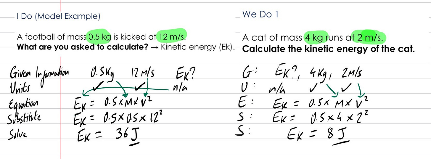
In fiction, this would be reverse-dramatic irony. In the classroom, we call it Expert-Induced blindness. The teacher holds the entire map in their head but, in turn, becomes an unreliable cartographer. A pen under a visualiser slows thought to human tempo. Each mark initiates purposeful thinking. Whether that be rearranging the following equation
to make velocity the subject, modelling how a leaky heart will make someone more fatigued, or solving a reacting-mass calculation.
Balancing Chemical Equations:
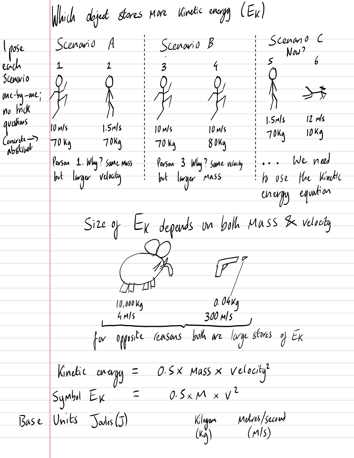
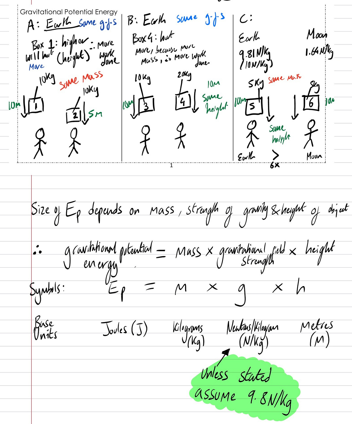
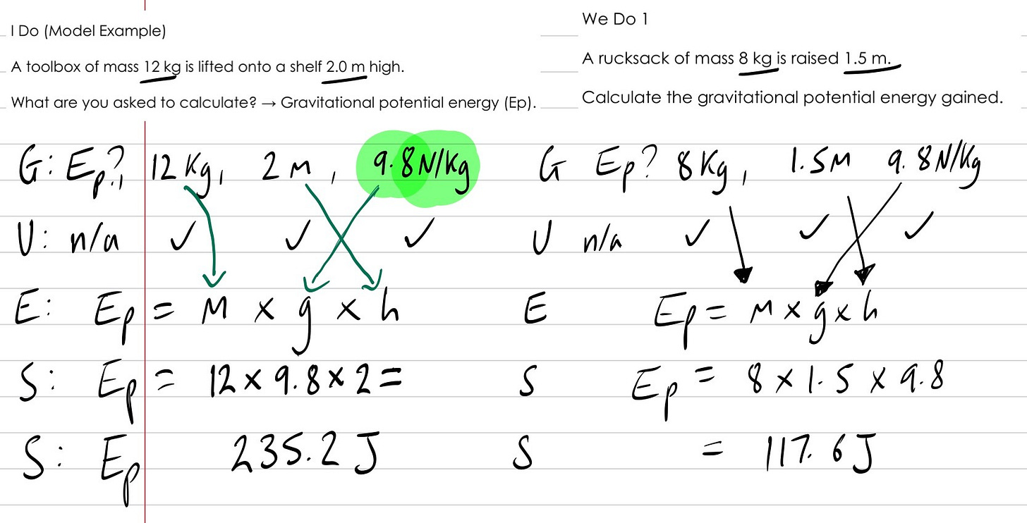
Conceptualisation of both Kinetic Energy and Gravitational Potential Energy, followed by GUESS SLOP:
Should we uninstall PowerPoint?
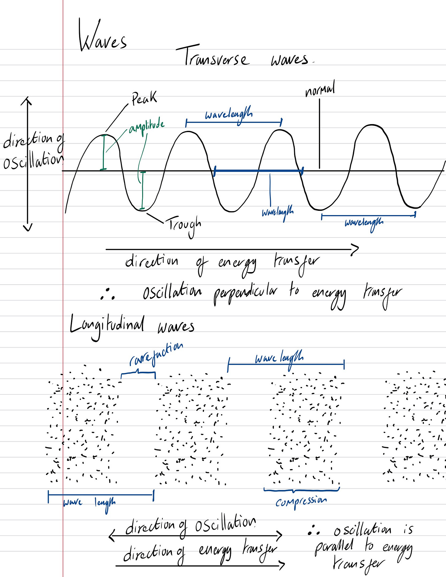
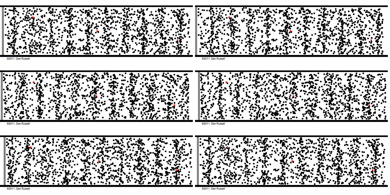
Absolutely not. Years later, for exposition, I still use PowerPoint, but with restraint and purpose. For example, when teaching waves, I want to show the difference in energy transfer between transverse and longitudinal waves. In that case, a GIF of the two waves does a better job of conveying that abstraction than a drawing (see below). As much as I have insulted the ancestors of PowerPoint today, credit, where credit is due: it is still a powerful medium for both checking for understanding and retrieval practice, very rarely for exposition. When working with a visualiser, the key is to be fluid in switching when appropriate: e.g., the Do Now is on slides; switch to the visualiser for exposition; back to slides for whole-class checking for understanding with mini-white boards; and stay on slides for Independent Task questions and feedback. Those sequences of events may vary if you work with booklets.
Also, spoiler alert: I have moved on from visualisers and currently utilise a 13-inch iPad Pro, and 99% of its use case is strictly for professional work. As a tool for content delivery (across all stages of a typical lesson), it is second to none, and I plan to defend that statement in a series of articles. The iPad is not stealing a living; it has earnt its Pro moniker, unlike my PlayStation 5 Pro. However, for content creation iPadOS in 2025 is a hindrance rather than an enabler, so I will still intellectually prepare and write my lesson resources on a desktop operating system using either Word or PowerPoint, depending on whether I intend to model from a printed worksheet.
The visualiser didn’t replace PowerPoint. It replaced the illusion that clarity could be pre-packaged.
The Broader Lesson
What started as a gentle departmental push reshaped the way I teach. The shift away from PowerPoint had little to do with style or preference. It marked a return to exposition as a live intellectual act — thinking with students, not performing at them.
In science, the craft lies in revealing the process of solving, not in polishing the presentation of answers. The most effective tools don’t perform the reasoning for us; they make the reasoning visible.
Next Time
For teaching, the visualiser was my scalpel. Wait—why did I just past-tense it?
Unapologetically, yes. Because I’ve moved on from visualisers, I’ve evolved again: the tablet. My visualiser has gone wireless. I write directly on an iPad mirrored to the board, annotating, circling, and layering diagrams live. It’s not just the exposition; the whole lesson can be delivered from the iPad. If PowerPoint were Charmander and the visualiser Charmeleon, the iPad is Charizard. What’s the tool equivalent of Mega Charizard? Maybe an augmented-reality headset such as an Apple Vision Pro or Meta Quest—but I digress.
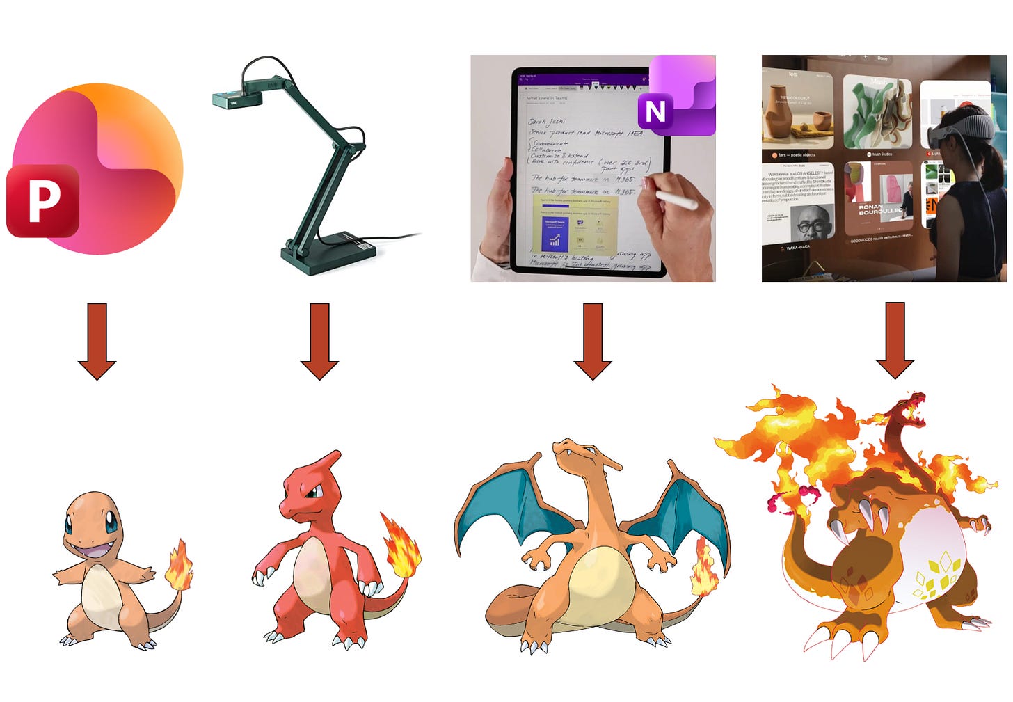
My musings on how I teach from an iPad—which model specifically, which software, why it is more advantageous than a visualiser alone, how it combines the strengths of both slides and visualisers—will form the next musing peppered with popcultural references. Heavily influenced by
’s piece of on why he avoids PowerPoint like the plague, opted for Microsoft OneNote instead, and why I ultimately chose a different path. This is the origin story of how I teach using a tablet. If, for whatever reason, you do not have access to a visualiser, I want you to think about your use of PowerPoint: the best tool is the tool at hand.In a future piece, I’ll share how teaching with an iPad—my Charizard phase—allows for the best of both worlds and not throwing out the baby with the bathwater.
Until then, Teaching, like science, advances through small experiments. Some are messy, some inconclusive, but all move us closer to clarity.
The classroom isn’t a stage for presentation. It’s a lab for cognition.
Experiences of other practitioners on the matter:
The case against Power Point as means of implementing curriculum -
Some Ramblings on Why I Don’t Use Powerpoint (much) in Teaching -
How I transitioned from Powerpoint-led lessons to drawing under a visualiser -
‘PowerPoint is not evil, but it is does make us lazy’
Setting the albatross free: Teaching without PowerPoint - Victoria Crooks
XXX



Really enjoyable and thought-provoking blog that I was prompted to read by posts on Bluesky. It would be great to see you over there too!
Stunning post thank you